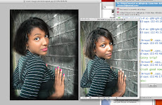
I decided that the red theme of the logo & text did not fit well with the edited cover image so I decided to change the entire colour scheme of the front cover, so that it fitted more appropiately with the photoshopped cover image.

The cover is below & after I had finished it I decided that it would be my final magazine cover.

.jpg)


Hi Ayshia, overall this is an excellent production. The image has been edited beautifully, she looks like a real star!
ReplyDeleteSome tips:
- This is supposed to be a new magazine. Think about your slogan at the top of the page. How do you know it's the fastest growing magazine?!
- 'Melita' text looks really good. Can you find a way to make it really jump off the page?
- The information on the left of the page is quite dark and difficult to read. Can you find a way to make it easier to read?
Current grade for front cover production:
ReplyDeleteL4 50/60