Tuesday 30 December 2008

Magazine Front Cover(Drafts)

This is the THIRD & FINAL DRAFT of my magazine cover:


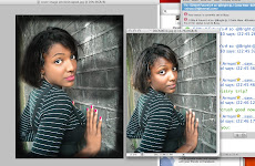
After creating these I decided that the cover image was not of a high enough standard and did not look appropriate on the front cover, so I decided to edit it and below is the finished product:


BEFORE editing AFTER editing


This is the SECOND DRAFT of my magazine front cover:


This is DRAFT ONE of my magazine front cover:


Exploring different Typefaces for my Final Magazine Cover

Bellow are variation of fonts which I have found through research and internet searching.

I intend to pursue a Pop/R n B/ Hip Hop genre of magazine and I would like help from readers of my blog, on deciding which typeface to use for my final cover.

Typefaces......


1.


Above is an edited version of the logo below which I created using Adobe Photoshop.


2.


3.


4.


Above is an edited version of the logo below which I created using Adobe Photoshop.


5.


6.


Tuesday 16 December 2008

Questionnaire & Results

While planning my music magazine I decided to create a questionnaire. (Below)


I gave this questionnaire to people aged 15-21 to decide whether my original theories about my target audience were correct. The questionnaire consisted of 10 questions to help me gain valuable information about what my target liked about magazines and what attracted them to it. And below are my findings.


_________________________________________________________


Whilst planning my magazine I said that more females are likely to buy the magazine. The results from my magazine show that more males took the questionnaire but still my theory was proven wrong as both male and females will be willing to buy the magazine.


I decided to ask this question seeing as my magazine is pop and R n B/ Hip Hop based and the feedback I got was very encouraging. 70% of the people that completed the questionnaire said that they would buy a magazine of this nature so I have decided to keep this as the base of the magazine as the results were positive.


I was planning to make the magazine £2.00 and from my findings I have come to the conclusion that this price is a reasonable price to pay, so I will be keeping it at this price. It was almost an even spread in the results but I have decided this price because up to £1.00 is not enough to cover printing and distribution costs. Also I do not believe that most of my target audience will be willing to pay up to £3.00 even though the results say different.


I had an idea of the things that I would like to include in my magazine but I wanted to get a clearer idea of what exact things my target audience liked and preferred. From the results I have gathered that the most important thing to include in my magazine is interviews which scored the highest amongst the other categories. I will definitely have interviews in every issue of my magazine and I will be incorporating all the categories such as music reviews, posters and competitions into my magazine.


I have already decided upon a genre for my magazine which will be a mixture of pop n R n B/ Hip Hop, but I still decided to ask this question just to gather as much information as possible before making my magazine. The results showed that R n B and Hip Hop were the most popular genre amongst my target audience. The results were very encouraging seeing as this genre will be in my magazine and my initial theories were proven correct.


I had not decided whether to include up and coming artists in my magazine but from the outstanding results I will be definitely be featuring these type of artists in my magazine.


I planned on making my magazine available every fortnight and from the results I will not be changing this. 50% of the people that filled out the questionnaire said they preferred.

Planning My Music Magazine

The target audience for my magazine are young people aged 15-21. I have chosen this group of people as my target audience because I think they will be attracted and interested in the type of music that my magazine promotes. People at these ages are usually interested in the popular music of the moment and the magazine I will creating will be based on this type of music. I have not targeted a specific audience in terms of gender but I do believe that more females will buy the magazine, and I will be exploring this further in my research in the form of a questionnaire.

My magazine will be about the popular music of the time and will be mainly pop and R&B/Hip Hop based. This may limit the amount of audience that I can attract to my magazine because it excludes other genres such as rock, dance music etc. Although this may be the case because pop and R&B/Hip Hop are hugely popular amongst these ages of people I will still be able to attract a good amount of readers to the magazine.

My magazine will be available for purchase every fortnight. I have chosen to do this because I believe that this would be best for a magazine of this nature. This is because if it were to be released weekly there might not be enough material to be put into the magazine. I have also taken into consideration the fact that the opposite could occur where a high profile musical event were to happen and the magazine could miss out on covering the story because it was not due to come out yet. That is why I have decided to create a website to update readers on all the latest events and stories from the music industry.

My magazine will cost £2.00 and I have thought very carefully when deciding upon this price. I have chosen to price the magazine at this because of my target audience. They will not be able to afford a magazine that was say, £5.00 this is due to the fact that they might not yet have jobs. Also because of the fact that many people at this age are still students in full time education and cant afford to buy a highly priced fortnightly magazine.

My magazine will not be a glossy and will be similar to NME more like a newspaper. This is because glossy magazines are more expensive and making the magazine more similar to a newspaper would be cheaper to produce and bring costs down and in turn it will allow the magazine to be cheaper for readers.

Research - Analysing Double Page Spreads [Video Presentation & 3 Textual Analysis]

Q Magazine


The language in this article is very well planned and through. Although it is not as complex and sophisticated as “Kerrang”, it still has a sense of being well put together. Also this adds a feeling of being laid back and not to fussy, the use of sub-headings adds to this.

The colours on the page fit well together and are all very much coherent. This adds a sense of order & structure to the page. On the page there is a mixture of bold text and plain text. This also adds to the idea of structure and clearly “heads” each section.

A lot of the space is taken up by the images and the effect of this is to attract readers, to visually draw them in. The two large images on the page, sub-headings & quotes, all of which readers can start reading from. They do not need to necessarily being reading from the beginning of the article etc. This use of multiple points of entry make readers feel as if they are in control.

Kerrang Magazine


The language use in the article is quite mature, intelligently written and it is obvious that a lot of thought has been put into it. They refer to the New York Times in the article, which gives the impression that they want a certain type of audience, people who are interested in texts such as the New York Times, which has a more developed readership. It also assumes that the readers have a prior knowledge of the music industry by stating:

“According to an internal cost analysis from the period, quoted in the New York Times the toll for recording around the period of 2002 amounted to a dizzying $244,000(£32,000) per month.”

Another feature of the spread is the colour & colour scheme. The colours on this page do not fit together very well. They are all sort of mismatched and I think this is very ineffective. The style of the text is not particularly adventurous at all. The text is plain with random hints of bold text. This gives the article visually, a melancholic tone as readers might feel that it would be too much work to read the article, as it is very unadorned and extensive.

There are numerous images on the page to attract reader’s attention, but the text is still sufficient but in my opinion it is not effective. I also do not think that this article makes valuable use of multiple point of entry. There is none in the text and the only the images.


The Artist featured in the article consists of two Caucasian males and they seem to be a far cry from the typical young white males of the mainstream bands today. They look well over middle aged and their appearances are quite ragged and scruffy. By the magazine choosing to feature this band in the article it shows that they are appealing to a more mature audience. It gives us as readers the impression that the readership of the magazine is of an older generation and this is who the article is targeted towards.

The article sticks to three main colours and has quite a simple colour scheme but it is still very effective. The band has been edited to be in black and white. This is very ironic because of their age. As I mentioned earlier they do not fir into the usual boy band category that we have today and their age is a big contributor to this. The fact that the picture is in black and white could be a way of highlighting the fact that they are quite old and a way in which to celebrate this very fact.
The background is colourless which may have been done because they want the main focus to be on the band. The Lime green colour used on the page is also very dominant and adds an edge to the black and white colour of everything else. It livens up the page and helps to attract readers into taking greater interest in the band and the article.

The style of text used on the page is not anything too dramatic or unique. It is quite simple and plain. The text is in one colour, which is black and regular font is used. Even though this all may seem rather dull, in the article, it works. It fits with the rest of the page and is still appealing even though no colour change or varied fonts are used. The font used is similar to the fonts on the other pages and this shows that the magazine wants to familiarise readers with this particular style and make them feel comfortable with it. It also shows that the magazine and its readership are not very concerned with what some might call necessities such as extravagant fonts and text etc. They appear to be laid back and more concerned with what the band have to say.

In this double page spread all the text is placed on he right hand side in columns, with the artists in an image on the right. This image takes up just over half of the double page but the text is still a good amount. When looking this page I get the impression that the audience value the image more than the text. This is because of the fact that the image takes up the most space and it is evident that a lot of thought has been put into the creation of the image.

The tone of the magazine is quite a tricky topic. On one hand it could be said that the band are quite welcoming in their manner. This is because of the fact that they are addressing readers with a direct mode of address, and one of them is smiling. This is also backed up because of the fact that they are leaning towards the audience, maybe initiating the audience to look into or join them. However, it could again be argued that the tone is quite cautious, as they look like they are guarding themselves. The second band member in particular who is in black, with his arms folded and wearing black sunglasses. This could be interpreted as them shielding themselves or addressing readers as part of their “in crowd”.


Video Analysis

Saturday 13 December 2008

Comparing "Clash Magazine" Contents Page to "Kerrang Magazine" contents Page

Clash magazine is a bi-monthly magazine which is aimed at 18-26 year old city slickers who enjoy live alternative music from a range of genre (e.g. rock, dance, hip-hop). It is very different to the contents page of Kerrang as it is extremely plain and has not many images at all. There is one main image on the page and only 3 additional images that go along with the contents, whereas in Kerrang, there are many images to grab the reader’s attention. The style of the page is well suited to its older target audience as it is plain, easy to read and is not over-produced with jubilant text, fonts, headings and images etc.

The layout of the page resembles the back of a CD cover in terms of the way the writing and images are placed. It is all listed neatly into columns for easy access and is easy on the eye. Also the central image is quite reminiscent of Jesus because of the pose. He is holding his arms, shoulder width apart and they are turned up to the sky and he is also looking upwards. This is very ironic as the man in the image fits the profile of the Jesus that is portrayed to the world, a white male with long brown hair and ample beard. This is a very significant fact as this is the main image on the contents and it is linked to Christianity and because of the mature readership they will notice this.

Analysis Of 'Kerrang' Contents Page Image

Research – Analysing contents pages (Kerrang Magazine)


The magazine uses many images on the contents page. It uses a wide range of these images to make the contents page look more attractive, but have also been constructed to give more information to readers about the featured artists and musicians in the magazine. In addition it gives readers an idea of the content of the rest of the magazine, the style and how it will be laid out. This supports the initial findings I had of the magazine from my analysis of the front cover. I found that it uses specific images to represent a story or piece of content and the images in the magazine are mostly made up of male bands.

The colours used are quite plain and simple, Black, yellow and white. The fonts used are also quite basic and no particular fonts have been selected to highlight a certain area of text. The colours and fonts on each page of the magazine are very consistent and these shows, that all the information on the page are equally valuable and nothing really stands out. There are subtle changes in font size but nothing drastic on the page. This also goes along with the style of the cover which is quite orderly and structured.

The information the page is very orderly. The content of the magazine is arranged in neat rows on the right hand side with clear headings. Also the images on the page are very organised and it is clear to understand and find things. This is very good as it helps readers to see and find everything clearly. This again shows how neat and orderly the magazine is even though they are trying to portray themselves as a crazy “rock and roll” magazine.

There are promotional features on the page which can be found on the bottom right hand corner. It is promoting a subscription to the magazine and it states the price and the amount of issues you will receive. The colour red is used in this part of the magazine to make it stand out and grab the reader’s attention.

The magazines logo can be found in several images on the contents page. However, they are not dominant and are not written in any particular font.

Friday 12 December 2008

Britney Spears Magazine Cover Analysis'


The image has been cropped into a mid-long shot so that the bed covers and her outfit are clearly visible. They have made sure that the only thing in the image to focus on is her and her top is open so that readers see that she is trying to get their attention. This is typical of men’s magazines as they generally have images of half naked women on their cover that ooze sex appeal.

The image is very focused on her silhouette which again oozes sex appeal. She is wearing lingerie that looks maybe as if it is from the 60’s which again links to the theme of the entire image. Even though she is wearing lingerie it is not that dramatic. Her bottoms are quite girly. They are pink have polka dots and have a little bow. Along with this and the other props such as the telly-tubby and the phone which are used to soften the image and not make it too sexual and seductive. The props are also used to show that “she’s a girl, but not yet a woman”. Her image is of course appealing to a male audience which takes up most of the readership of this particular magazine.

The image is meant to imitate that of the classic film “Lolita”. This inter-textual reference carries meaning because in the video of her debut single “hit me baby one more time” she is practically playing a school girl trying to seduce older men, which is exactly what she is trying to do in the image and the message that she is giving off.

The colours used in the image are very significant as well. There are a lot of different shades of pink.. This makes Britney look more feminine and again adds to the appeal of the image. The black used also shows that she is a bit more mature.


The image has again been cropped into a mid-long shot just as in the previous cover I analysed. This highlights the fact that the editors of the image want her whole body to be seen to satisfy the male audience, who make up 59% of the readership whilst women make up only 42%.

Britney is practically naked in this image apart from her underwear and the towel she is holding to cover her breasts. This choice of costume makes it evident to readers the type of relationship she wants with her audience. She wants people to see her as a kind of “sex icon” and even thought she is a musician the image does not refer to her music in any way shape or form. Also her pose is quite sexual as she is emphasising her bum and is overtly trying to look sexy.

In the image it looks as if Britney is standing in the doorway to a bedroom. Again this links back to her appeal to the male audience of the magazine. It seems as if she is saying to the audience “come into my room” in an attempt to seduce readers.

The lighting in this image is very bright. This makes her skin glow and softens the image. There is also use of hi-key lighting. She is mixing quite obvious sexuality with innocence and the colours used help portray this is idea because white is a colour that is associated with purity.


I think this image has been chosen because at the time the issue was released it was a highly known fact that Britney was having a great deal of trouble in her life. The image is also in black and white which could be interpreted as her seeming to be lifeless. It could also be seen as a reference to the past.

The image is a close-up which is a big difference from the previous covers she has dominated. This could be due to the fact that her body is not in the same shape as it used to be after two children, but it could also be down to the fact that it gives the impression that the interview will be very in depth. Make readers feel as if they are going to see the real Britney. I have also noticed that the camera angle of the image is a very low camera angle and this gives the impression that her eyes are turned down to the sides, like she is sad. This links back to the state of her well being and life at the time this issue was printed. From the image I get the impression that she would like a close and personal relationship with readers.


Preliminary Task: How I Edited The Images For My Front Cover


Thursday 11 December 2008

Preliminary Task: College Magazine Contents Page


This is the contents page of my college magazine & preliminary task entitled “College Confidential”. When creating this contents page I tried to follow as many magazine conventions as possible.

I placed the heading of the magazine at the top as I have resrached and have found that most titles are on the top and are noticeable. I have also listed the other features of the magaizne and the page numbers also, which are both magazine conventions. There is an image on the page along with some text which both link to the cover image. From looking at other magaiznes this is a very popular thing to so I have incorporated this into my own contents page.

This is the first draft of my contents page & preliminary task, and after more thourough research I have found that many improvements could be made to it. They are as follows:

· A more professional and clear heading
· A message from the editor could be added
· More colour could be used
· More effects could be used to manipulate the images and graphic features
· Fonts could be more varied and experimented with.

These are some of the improvements that I have come up with that could make my contents page look more professional, and I will be considering these when making the contents page for my music magazine.


Preliminary Task: College Magazine Front Cover


This is the front cover of my college magazine & preliminary task entitled “College Confidential”. When creating this cover I tried to follow as many magazine conventions as possible.

I placed the heading of the magazine at the top as I have resrached and have found that most titles are on the top, are noticeable and eye-catching . I have also added numerous puffs around the cover. They are all different colours and contain information from features in the magazine. Puffs are a very popular convention of magazine front covers so I have imcorporated them onto my front cover. I have also added a tag line and a graphic feature of a “20p” in a star. I also found that these are custom on good magazine covers. There is a central image on the page along with anchorage text which links to the cover image.. Againt is another convention I attempted to follow.

This is the first draft of my front cover & preliminary task, and after more thourough research I have found that many improvements could be made to it. They are as follows:

· A more professional and clear heading
· More professional and well-constructed puffs
· Colour to be used more strategically
· More effects could be used to manipulate the images and graphic features
· Fonts could be more varied and experimented with.
· Cover image could be edited e.g cropped, lightened etc.
· Price, Barcode could be added along with the date release and issue number

These are some of the improvements that I have come up with that could make my front cover look more professional, and I will be considering these when making the front cover for my music magazine.

Wednesday 10 December 2008

Key Conventions Of Magazine Covers


Labelling the front cover to distinguish key conventions that could be applied to my own magazine cover.


Analysis Of "NME" Magazine Front Cover


NME (New Music Experience) is a niche music magazine and from the front cover this is very evident. This shows readers that there will be information about new bands and new music being delivered very fast to people who will to read the magazine.

From looking at the front cover I can tell that inside the magazine there will be a lot about bands because there are four bands on the cover. Most of the issues in the magazine will be to do with the latest/up and coming musicians, as it is a music magazine of this nature.

The target audience of this particular magazine are young people who are interested in new up and coming rock/indie musicians & bands such as Kaiser Chiefs and the Arctic Monkeys who are featured on this particular cover. White males in particular. I can tell this because in one of the puffs on the page (the left hand bottom corner) it is featuring a new band and telling readers that it is their very first interview. And all the puffs are about white males who are in the UK music industry. The magazine is looking to attract readers who are into this “underground” scene of British music and who enjoy going to gigs and festivals to see these musicians perform. The images around the page present these bands as live performers.

The cover image features the Arctic monkeys and the way in which they are addressing the audience is quite friendly & approachable. The lead singer is looking straight at readers (direct mode of address) and the rest of the band look quite laid back and are smiling. This shows that they want the readers to like them and they want a warm and blissful connection with their fans and readers of the magazine. This may be due to the fact that the Artic Monkeys found fame from Myspace so they do have a dose relationship with their fans. Also the picture of the band is in black and white which is associated with the past. This could be interpreted as the magazine trying to show that the band have almost become classic and are like the great bands of the past years.

As I mentioned before the name of the band on the cover are The Arctic Monkeys. I think that the magazine editor chose to have them on the front cover because they represent what NME is about down to every last inch. They were new and up and coming on the scene until now. Now they are well known and quite a successful indie/rock band in the UK. They appeal to the target audience who buy this magazine and by having them on the cover it could also boost sales as they are the band that everyone wants to read/ know about at the moment.

The anchorage text on the cover says: What the world’s been waiting for...ARCTIC MONKEYS…it’s all kicking right off!”

This proves the point I made earlier about the magazine editors believing that the Arctic Monkeys are the “next big thing” they are “what the world’s been waiting for”. They believe the band will help boost sales which is one of the most important things that the editor has to worry about when choosing who to put on the cover. Also this tells us that the group are highly regarded amongst people in this scene of music and interests. It shows that they are at the top of their game.

The message that the band are sending out is a message of warmth and kindness. They are connecting with readers although they are not all addressing them directly because of their laid-back attitude and the smiles on their faces this message is still being projected.

In this magazine a certain group of people are being represented. A group of people who are interested in rock/indie music more specifically white males. The magazine represents them as glad and laid-back and are showing them in a positive light.

There is buzz word on this cover which is “kicking off” which makes the band sound more exciting and adds a sense of danger. There are not many buzz words on this page and the one that I found is not that noticeable such as more common buzz words like: “new” or “exclusive”. I think they have chosen not to use the more common buzz words because they want to be seen as different and unique compared to other magazines and also because they do not want to draw attention away from the main feature of the cover which of course are the band.

The title of the magazine is written in bold and is does not really blend in with the rest of the font and text on the cover. It stands out. This shows that they want the title to be noticed by readers and even though there is a cover image to be focused on the title is still very important. Also the colour red shows vibrancy and again can also represent danger which gives the magazine an edge. This links to the readership of the magazine, people who are edgy, vibrant and unique. Also NME started as more of a music newspaper and has only become more glossy in recent years and the word “Express” suggests that it is a newspaper. Also the acronym ‘NME’ or enemy can be viewed as the magazine trying to say that they are the enemy of mainstream magazines.

There are puffs on the front cover and they are all involving male white musicians who are the target audience of this particular magazine. They suggest the magazine with be solely about music and industry events.

On the front cover a wide range of colours are used but pink is the main colour that is noticeable. This is unusual because of the fact that the target audience for the magazine are young, white, males. But this also shows that the magazine might have done this to maybe attract people who are from other backgrounds and females aswell. All the colours on the cover are quite vibrant, lively and are quite pleasing to most people. All the fonts used are bold and again this shows vibrance and energy.

The magazine uses phrases such as “their first interview” and “backstage at the UK’s hottest tour” to help attract readers. Doing this makes readers feel that they are getting inside information. The latest news and can really help to attract more readers.

Tuesday 9 December 2008

Kerrang Magazine Analysis 2


Kerrang is a music magazine and from the front cover this is very evident. Even from the title we get this impression by the use of onomatopoeia in the word “Kerrang”. It sounds like the strumming on a guitar, which is the instrument it is associated with. Also from the front cover I can tell that inside the magazine there will be a lot about bands because there are 4 images on the cover and they are all of bands, m ale Caucasian bands to be precise.

The target audience for this particular magazine are young white males who are interested in musicians and bands such as ‘Triviam’, ‘Madina Lake’ and other bands of this nature. I can tell this because both of the bands that I mentioned are featured on the front cover and these bands take up all but one of the puffs on the front cover. The magazine is looking to attract readers who are into this “pop-rock boy band” image, people who enjoy this type of music and take pleasure in going to gigs and festivals to see these musicians perform.

The cover image is of a band named You Me At Six and the way in which they are addressing the audience is in quite a cool manner and reflects their rock attributes and persona. They are all looking directly at readers but the lead singer is making a face. A face that looks as if he is screaming in shock, which again adds to their persona and gives the band an edge. Also I noticed that all the bands clothing are all black and are all quite similar along with their boy next door hairstyles. This could be used to show that they want to bee seen as one because they are all in sync.

As I mentioned previously the name of the band on the front cover are You Me At Six. I think that the magazine editor chose to have them on the front cover because they represent what the magazine is all about, the “pop-rock boy band” image down to every last inch. Also the anchorage text leads me to believe that the band is quite new on the scene because of the phrase:

“Rocks New Hotshots You Me At Six Doing It Their Way”

This also leads me to believe that they are quite edgy because it says that they are doing it their way which means they must be different from other bands in this genre in some way, shape or form. Also the band have a very strong and loyal fan base and the editors know that these fans will buy the magazine because the band are on the front cover, so in turn they most probably will help to boost magazine sales. This is every important because it is one of the things that the editor worries about most when choosing who to put on the front cover. They appeal to the target audience and because of their dedicated fans it is almost a certainty that the magazine will sell. It also shows that they are quite highly regarded amongst people in this scene of music and interests.

The message that the band are sending out is a message of warmth and they are quite welcoming. They are connecting with readers because of their direct mode of address and the smiles on their faces. Their poses also portray them as quite laid back and are showing them in a positive light.

In this magazine a certain group of people are being represented. A group of people who are interested in rock, pop and punk kind of music more specifically white males. The magazine represents them as quite cool and is showing them in an encouraging manner.

There many buzz words on this page such as ‘new’ and ‘hotshots’. This adds stimulation to the cover and makes the band seem more exciting. I think that the use of many buzz words on this page is very clever as it draws readers in when they glance at the cover.

The title of the magazine is written at the top of the page and it has a kind of broken glass effect. This could be interpreted as the smashing of a glass or mirror maybe by a guitar which links back to the rock and roll lifestyle that this magazine is trying to portray. The use of onomatopoeia and the broken glass effect in the title all link and are woven together to show that the magazine is of a musical nature. And it also gives the magazine an edge and adds vibrancy which leads back to the readership of this particular magazine. The title is black which is a neutral colour and because the artists are placed over the title it shows that the magazine is quite popular, because it can still be identified without the title being in full view. Also the magazine builds up its image as it uses the same colours on every cover which is black & white.

The puffs on the front cover are all involving white males who are the target audience for this magazine. They suggest the magazine will be solely about these types of boy bands and music of that particular genre.

On the front cover a wide range of colours are used but black is the colour that stands out most. This is typical because this colour is associated with males and is seen as quite a hard and rough, colour. This again shows that the magazine is targeting towards males. There are other colours that are on the page such as yellow, green and red which could be seen as them also trying to attract people that are not necessarily part of their target audience.

The magazine uses strategies such as “free posters” to help attract readers to make them feel like they are getting more for their money. Using this strategy is very clever as some people might even buy the magazine just so that they can get the free posters.


Wednesday 3 December 2008

Analysis Of "Kerrang" Magazine Front Cover


This is a niche music magazine and from the front cover I can tell that there will a lot about bands and music inside.

The main target audience for Kerrang magazine are 15-19 year olds who are interested in rock/punk/grunge/indie music etc. I get this impression because of the bands listed at the bottom of the cover who will be inside the issue and because of the central image of the magazine.

In the central image there is a picture of a man who is being tattooed by a woman. They are both heavily tattooed and the picture is quite dramatic. It is obvious to readers that the man is the main focus of the central image and he is looking at readers with a direct mode of address.

The expression on his face is not that welcoming. You kind of get the sense that he is being very protective and is saying stay away…back off. But even though he is doing this it is evident that he wants readers to read about him and to buy the magazine.

The person in question is Matt Heafy who is a member of the rock band TRIVIUM. He is on the cover because he is someone that the magazine’s target audience will be interested in and to help attract readers.

The anchorage text says: “Under the skin of Matt Heafy TRIVIUM”…
Because of what is going on in the image I can tell that the anchorage text is referring to his tattoos. It is a play on words which the target audience and regular readers of the magazine will understand it instantly. Some people might get the idea that he is quite tough because of his many tattoos and this portrays the idea of him being rebellious.

People who have “alternative lifestyles” e.g. Goths, punks etc. are being represented in this magazine. They are represented as people who enjoy the “alternative lifestyle” and everything that goes along with it. i.e. hard core rock music and tattoos which are the usual stereotypes.

The design of the block title tells me that the magazine is quite edgy. This is because the title looks like it has been smashed. It has the effect of a smashed glass or mirror which is quite edgy and again alternate.

The title in particular gives me a lot of information about the entire magazine. From the title “Kerrang” I can tell that maybe the magazine has something to do with music because of the evident use of onomatopoeia. The word “Kerrang” sounds like a guitar being strummed and again links back to the theme as it is a music magazine. I can also tell what image is trying to be portrayed. An image of roughness, edginess, and uniqueness is being portrayed in this magazine. And the style of the magazine is very dark but at the same time very vibrant.

There are puffs on the front cover and they tell me that there will be free posters inside, and tells me about the bands/artists being interviewed inside. Because of the types of bands mentioned I can see that the magazine is being targeted to maybe teenage girls because the bands are mostly young males. Also because the names of the bands are listed at the bottom of the cover I it will help readers because they can see exactly what will be in the magazine.

The slogan of this magazine is…..LIFE IS LOUD. Again it links back to the musical attributes of the magazine and is linked with sound, noise and gives the image of being live. It might help to attract readers because from the slogan they can tell that it will be a music magazine and one that is quite edgy, loud and typically ‘rock and roll’.

The colours used on the front cover are quite dark, there is a lot of black and the colours reflect the stereotypes of this type of music. Surprisingly I do find the colours attractive but other might not agree. The fonts used are not to complex or fancy but they are all bold and thick which again gives an idea of toughness. The cover of “Kerrang” magazine always has a range of rock sub-genres so that it attracts as many of the audience as possible.

The magazine uses freebies to help entice readers into buying such as posters. They do this to keep the current readers satisfied and might even do special offers such as free CD’s, stickers and calendars etc. to help attract new ones.