
This is the front cover of my college magazine & preliminary task entitled “College Confidential”. When creating this cover I tried to follow as many magazine conventions as possible.
I placed the heading of the magazine at the top as I have resrached and have found that most titles are on the top, are noticeable and eye-catching . I have also added numerous puffs around the cover. They are all different colours and contain information from features in the magazine. Puffs are a very popular convention of magazine front covers so I have imcorporated them onto my front cover. I have also added a tag line and a graphic feature of a “20p” in a star. I also found that these are custom on good magazine covers. There is a central image on the page along with anchorage text which links to the cover image.. Againt is another convention I attempted to follow.
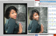
This is the first draft of my front cover & preliminary task, and after more thourough research I have found that many improvements could be made to it. They are as follows:
· A more professional and clear heading
· More professional and well-constructed puffs
· Colour to be used more strategically
· More effects could be used to manipulate the images and graphic features
· Fonts could be more varied and experimented with.
· Cover image could be edited e.g cropped, lightened etc.
· Price, Barcode could be added along with the date release and issue number
These are some of the improvements that I have come up with that could make my front cover look more professional, and I will be considering these when making the front cover for my music magazine.
.jpg)


No comments:
Post a Comment
Thank You for taking the time to comment on my work. It's very useful to me so again, thanks.
=]